Printed Annual Reports
Texas A&M Division of Information Technology publishes an annual report to highlight key metrics and achievements from the fiscal year. These reports are primarily targeted at university administrators to quickly demonstrate the value the Division brings to Texas A&M.
2017 Annual Report: The Shape of IT
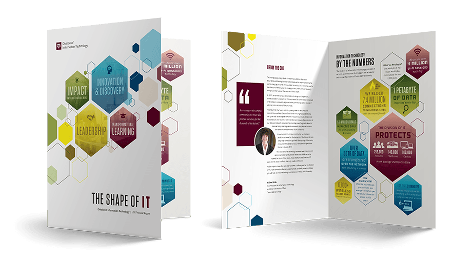
Hexagon Motif
We used four main categories with color coded spreads to represent the themes of transformational learning, innovation & discovery, impact on the state, nation, and world, and leadership. Each spread maintained the hexagon "shape" motif, with a combination of photography and infographics.

Focus on Infographics
Not all stories about information technology are always easy for the average person to understand – or even be interested in. To help with this problem, I created infographics to accompany several stories.


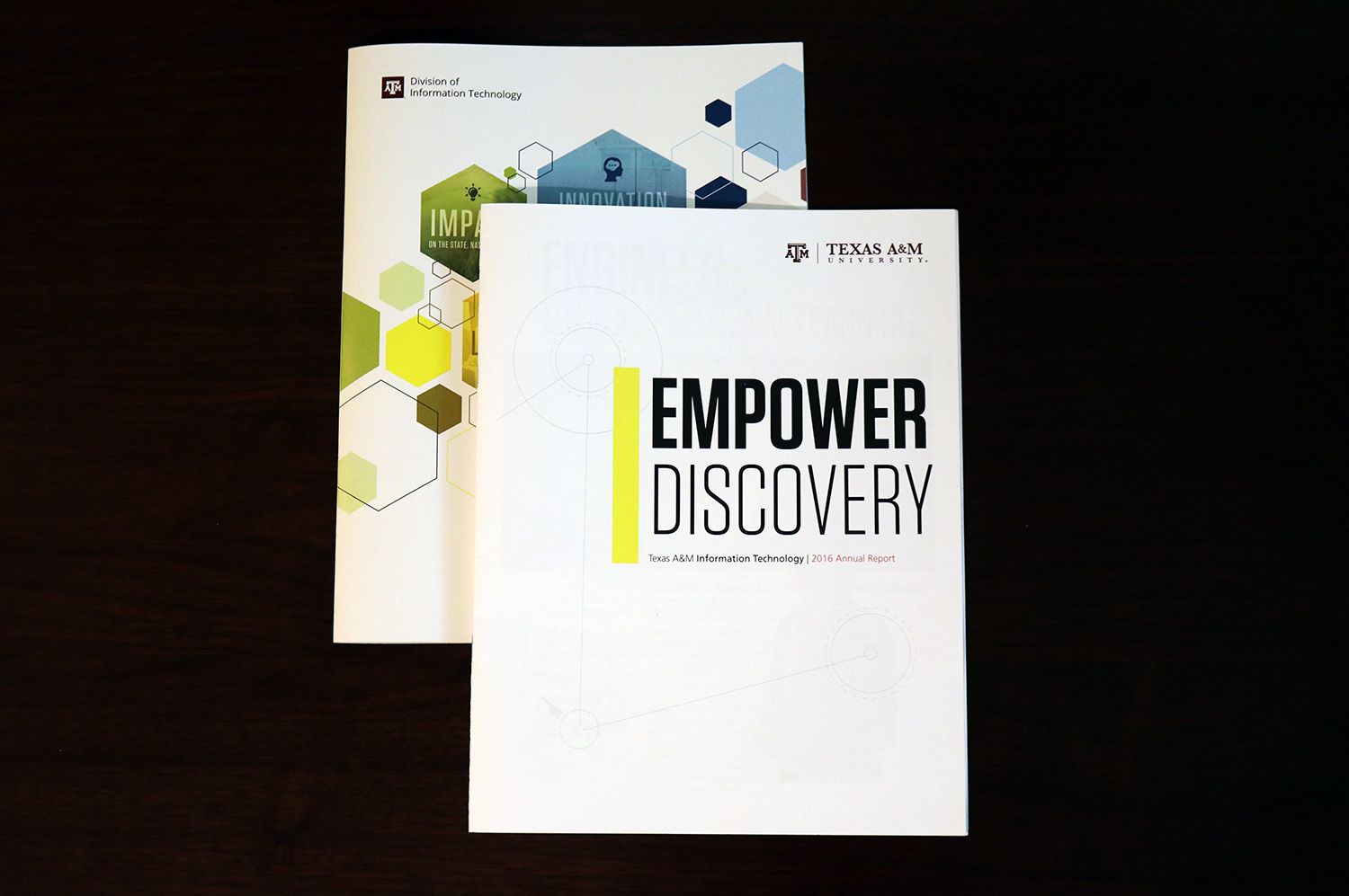
2016 Annual Report: Empower Discovery
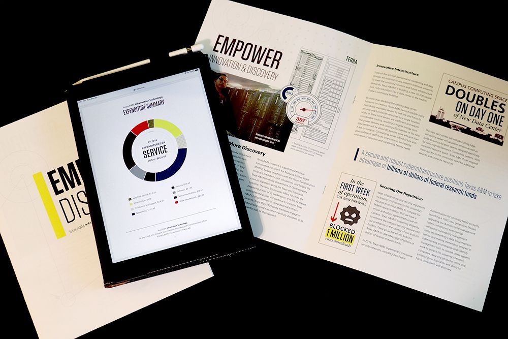
The 2016 annual report was produced right after the unveiling of an updated brand guide for Texas A&M University. A couple of our design goals for this piece were to embrace the new brand while pairing it with elements we were using on our website, it.tamu.edu.
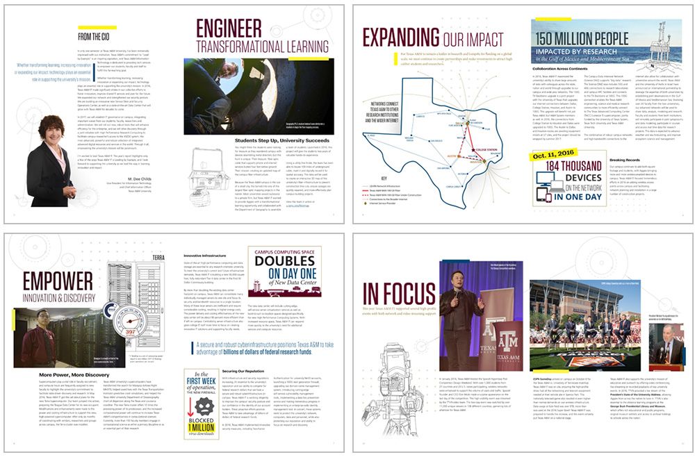
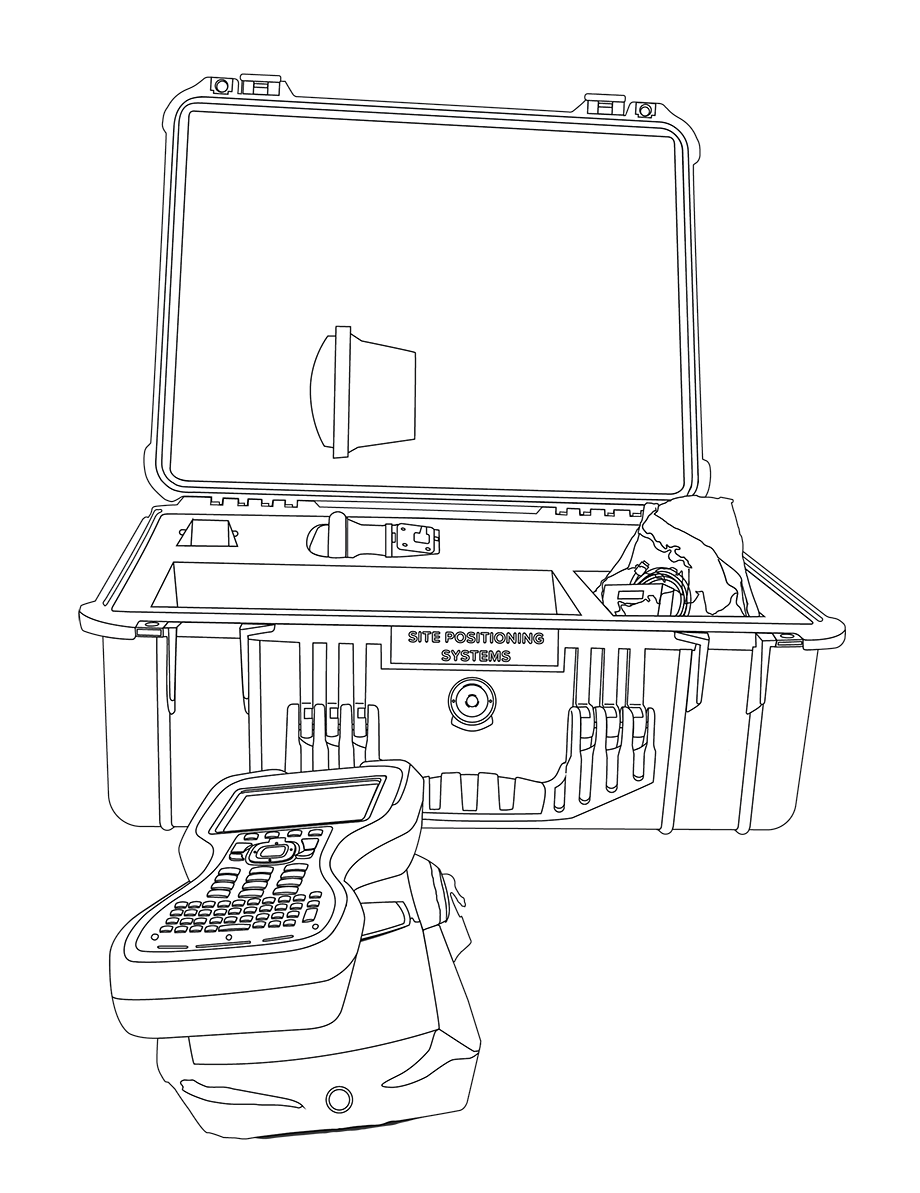
Line Illustrations + Photography
One component of the new brand guide that hasn't seen a lot of use is line illustrations. I created an illustration for each spread of the report to complement a photograph to create a strong style that carried throughout the piece.
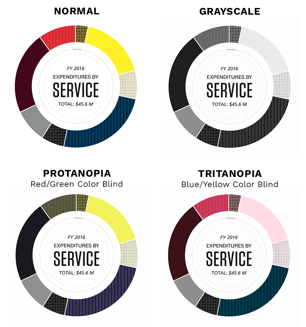
Pie Charts and Accessibility
A key piece of the annual report is displaying the Division's expenditures for the fiscal year. When designing charts, it's important to consider different use cases for viewing the report, such as:
- Printed full-color publication
- Online full-color PDF
- Printed grayscale copy
It's also important to remember that some people have forms of color blindness, such as protanopia or tritanopia. For all of these reasons, it's crucial to not only rely on color to distinguish sections in charts and graphs.
To help add clarity, I add a patterned texture to chart sections in a multiplied version of the brand color.