Data Visualization in Project Management
Over the course of the One IT project, my team combined the content of seven websites into a "one-stop-shop" for information about IT at Texas A&M. The final website has over 400 pages of content and several custom-developed capabilities. Over the course of 20 months, we planned, designed, developed, and deployed multiple staged releases.
In addition to designing the website, I served as project manager for this highly complex and detail-oriented initiative. Using my design skills, I incorporated data visualization into my project management process to create documents, tools and processes that powered the One IT project.
Site Architecture
In order to help our team stay on the same page, I created a schema for labeling each page of content in relationship to all of the other pages.
Numbering Scheme
I created a numbering scheme help our team navigate the content. Each top level navigation item was given a number in the order that they would appear in navigation: 1. Services, 2. Leadership, 3. Policy, 4. Security, 5. Community, and 6. Help.
Within each of these sections, each Level 2 navigational item was assigned a number. For example, the subsections of Leadership included: 2.1 Office of the CIO; 2.2 IT Governance; 2.3 Strategic Initiatives; 2.4 Division of IT; 2.5 Reports & Publications; and 2.6 News.
This pattern continues as you enter Level 3, the "microsite". If we follow 2.2 IT Governance, we get the sections 2.2.1 Purpose, 2.2.2 Committees, 2.3 Members, and 2.2.4 IT Governance Calendar. Because IT Governance is the most complex "microsite", this pattern continues as the pages get deeper, such as the page 2.2.2.1 EITC, the page for the Executive IT Committee.
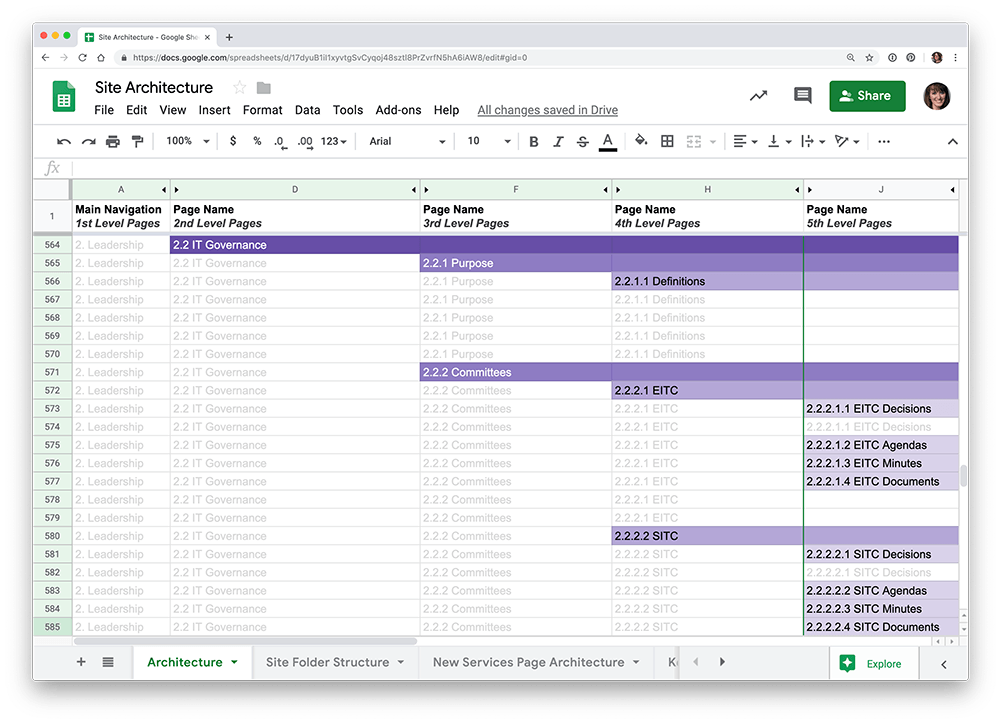
Site Architecture Spreadsheet
To visualize this hierarchy of content, I created a spreadsheet that detailed the website's architecture. Utilizing filters, the spreadsheet was able to make a large amount of information easy to navigate.
Managing Content Creation in Google Docs
In order to help make sure that all of the content was written for each page, I created a system to track the progress of content as it was written, edited and reviewed.
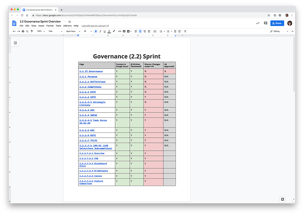
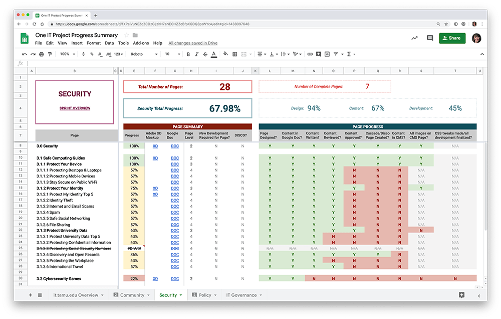
Sprint Overview
Each sprint had an overview document that outlined the pages included in the section. This document served as a way for our content coordinator to keep track of which pages had been written, reviewed, and put into the CMS. We also utilized this document as a place to record last minute items that needed to be addressed in the two weeks before launch.
Page Content Docs
Each HTML page got its own Page Content Google doc that got its name from the Site Architecture spreadsheet. The documents included a space to record information about the page and to record content, creating a focused process for writing page content and metadata.
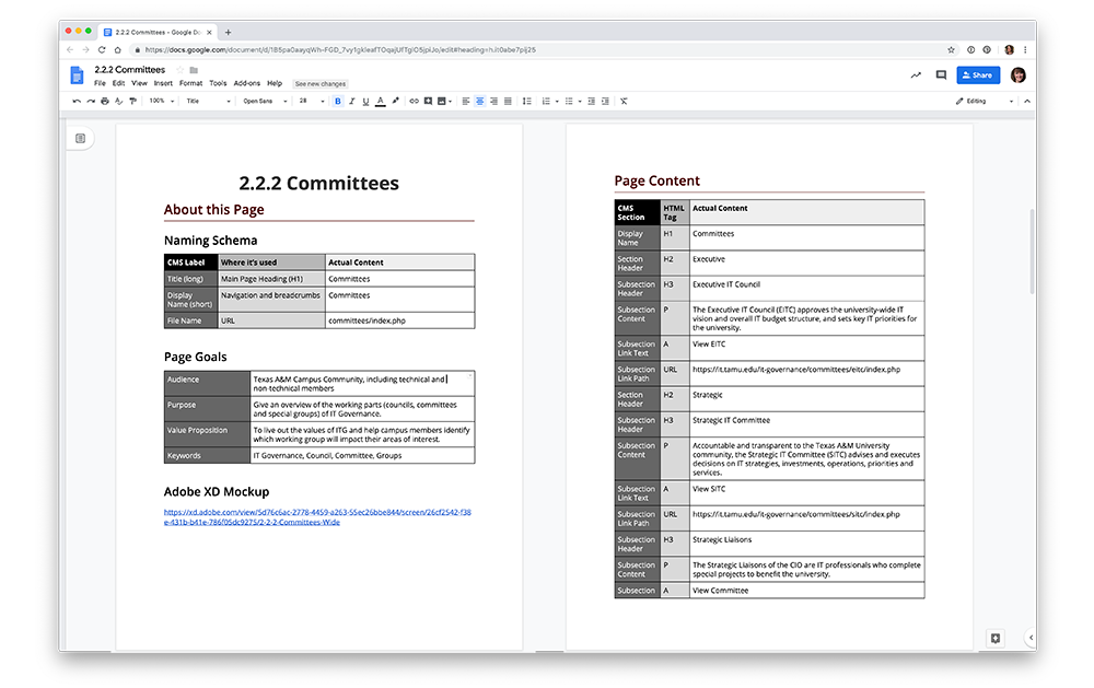
Our CMS presents a form as the primary method input method for editing a page. In our Page Content documents, we used a table to label each piece of content with the corresponding CMS form label and the semantic HTML tag that it would output. This helped us make sure our content met WCAG 2.0 accessibility requirements for appropriately nested headings, as well as making sure content was input into the CMS correctly.
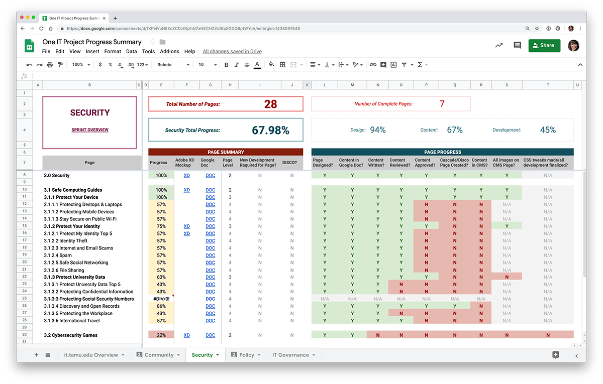
Progress Spreadsheet
In order to make sure the project was staying on track, I created the One IT Progress Overview spreadsheet. This tool allowed me to visualize the scale of the work needed for each section, how much work needed to completed for each section in each category (design, content, and development), and each individual page's progress.
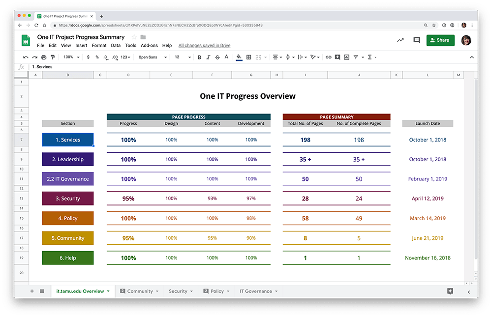
Each sprint's tab created a dashboard for me as the project manager. Utilizing calculations and conditional formatting, I was able to easily see the scale of work and progress made for each role (content coordinator, designer, and developer) and each page. With hundreds of pages to move from concept through publication, this method helped me make sure nothing fell through the cracks.
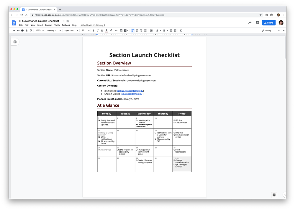
Section Launch Checklist
During the course of our project, our division started utilizing Change Management. To make change management something that we thought about early, I started incorporating the Section Launch Checklist into our iterative launches.
I started filling out the checklist as soon as we had worked on a section enough to get a good estimate from our developers on how many weeks it would take to complete all of the features for that section, and how long it would take the content coordinator to write and/or revise the content. As soon as we had an anticipated launch date, I would begin filling out the Section Launch Checklist.