One IT Case Study: Rethinking a Website Strategy
Having worked at Texas A&M Division of IT for a little over a year, I often found myself wondering why. Why did we have so many websites with obscure URLs? Why did all of our websites and applications look so drastically different? Why did you need institutional knowledge to be able to find the content you needed?
Looking at our fleet of websites, I couldn't help but wonder if there was a better way to organize and present all of this information. When assigned to redesign one of our flagship websites, cio.tamu.edu, I started voicing some of the questions that had been consuming me over the last year. My fresh perspective and pointed questions led our team to reevaluate our website strategy.
Project Overview
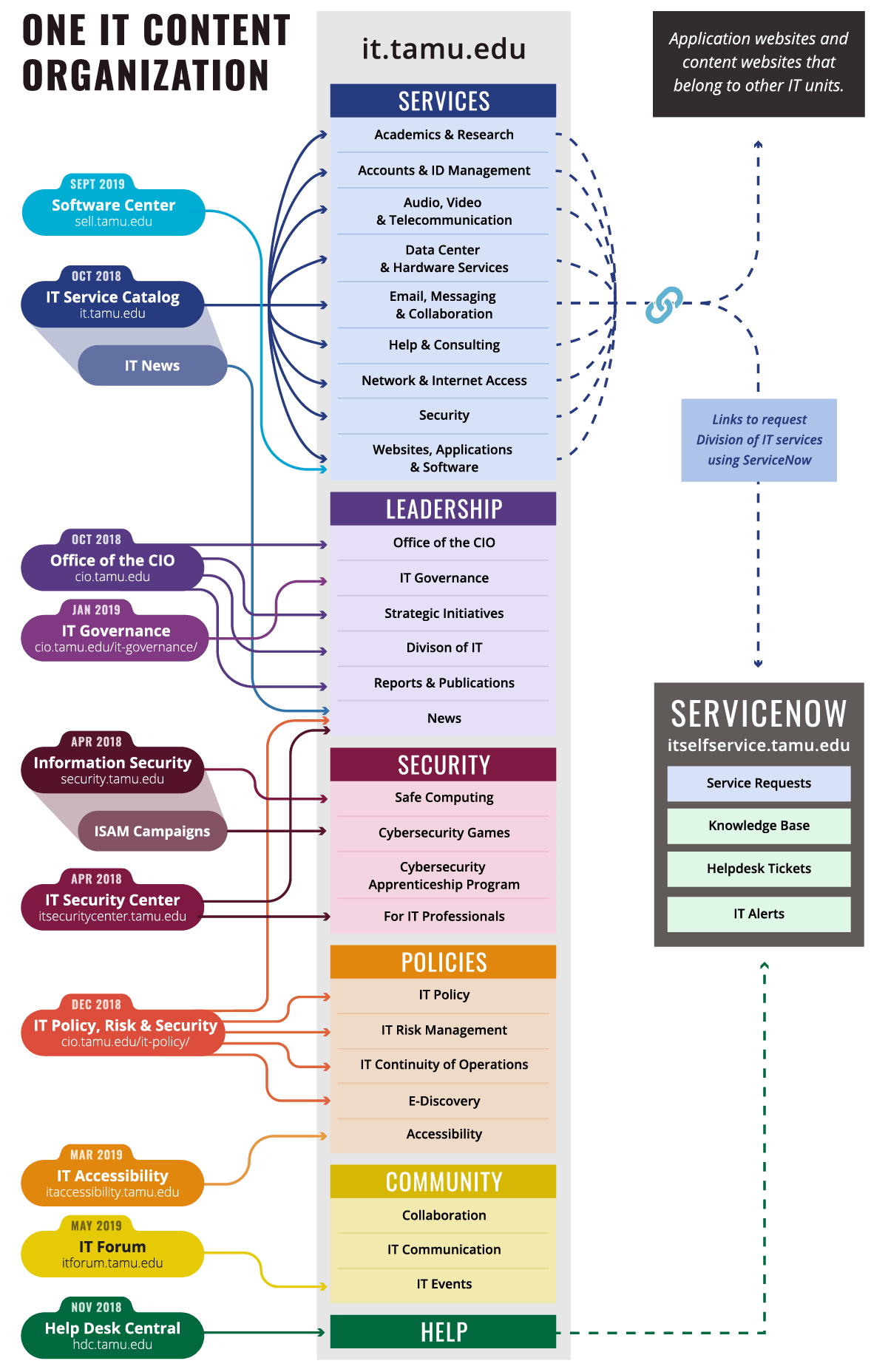
In the fall of 2017, the Division of IT was managing over 40 public-facing websites and web applications. Looking at our content-focused websites specifically (excluding web apps), we had a large disparity of web traffic across our sites. From May 2016 through May 2017, our flagship site (it.tamu.edu) received more unique page views (UPV) than all of our other sites combined, and 3.6 times as many UPV as our next most-visited site (hdc.tamu.edu).
The number of websites had grown significantly over the past five years, and was becoming a difficult for our team to maintain in terms of content and development. Each content-focused website had been created with a target audience in mind (i.e., students, IT professionals). Although each site had a unique content strategy, none of them included a thorough strategy for dealing with maintenance, leading to content rot, dated design, and unpatched frameworks and libraries.
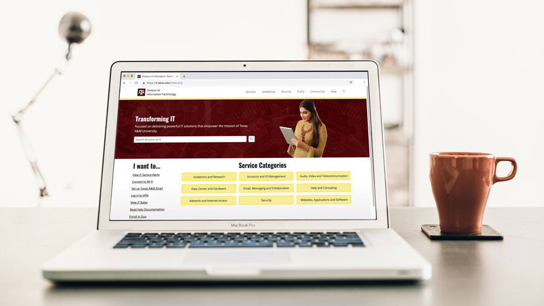
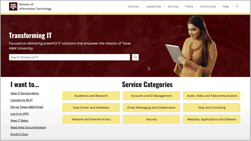
After months of research, discussion, and deliberation, we created a new web strategy that transformed our most prominent and highly-trafficked website (it.tamu.edu) into a "one-stop-shop" for information about IT at Texas A&M.
Design
Since this project dealt with multiple content types and audiences, we needed to create a cohesive design that still allowed content from the sites we planned to merge to feel distinct.
Organization
Our first challenge was deciding on the most strategic way to organize our content. To guide our discussions, I researched IT websites from dozens of peer institutions and diagramed their content organization. We used these diagrams to compare how we were presenting information on our two flagship websites (it.tamu.edu and cio.tamu.edu) to how our peers were handling the same types of content within one website.
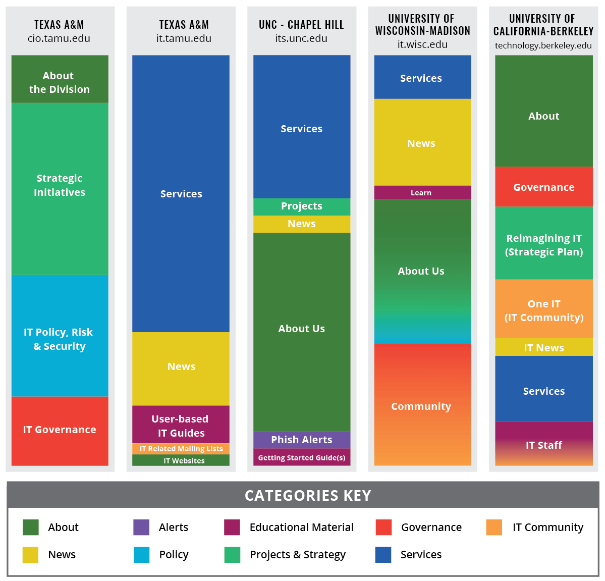
Using my research and our division's priorities, we decided that we would have six top-level "buckets" that would hold all of our content: Services, Leadership, Policy, Security, Community, and Help. The launch of each section was scheduled for iterative release over the course of a year.
Learn more about our project management strategies in my blog post "Data Visualization in Project Management".
Navigation
The amount and complexity of the content we were moving into one website meant that navigation was going to be the most important design choice. We wanted to make sure that wherever a visitor entered the site, they didn't feel lost or too overwhelmed.
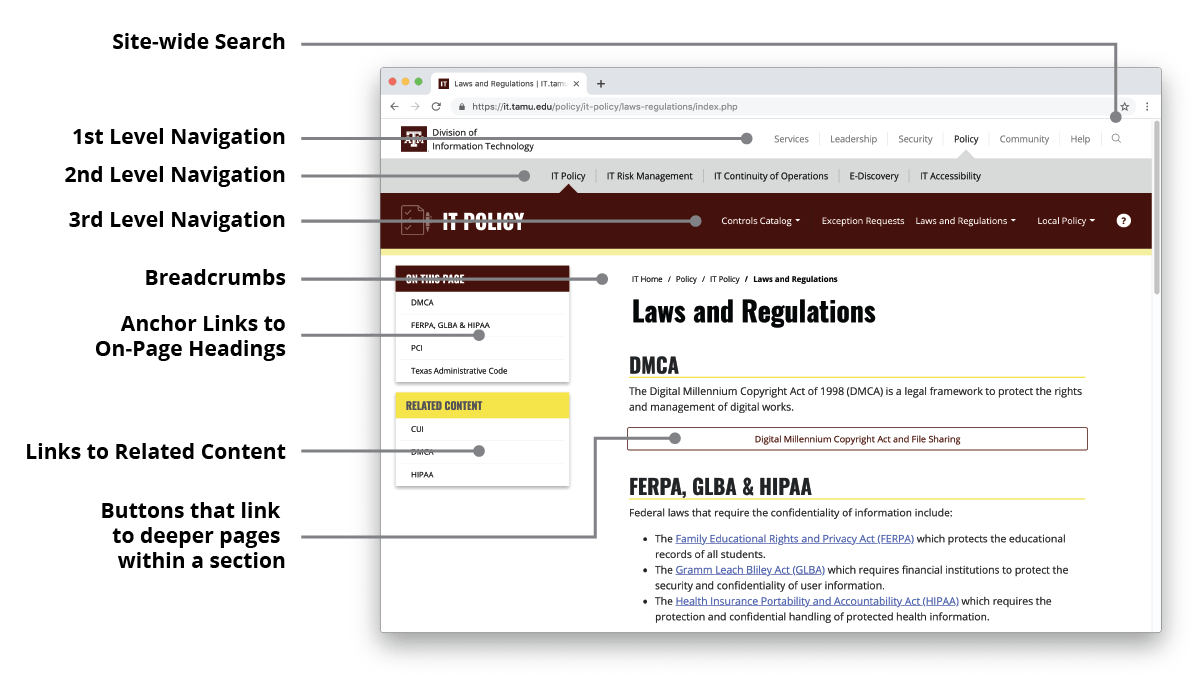
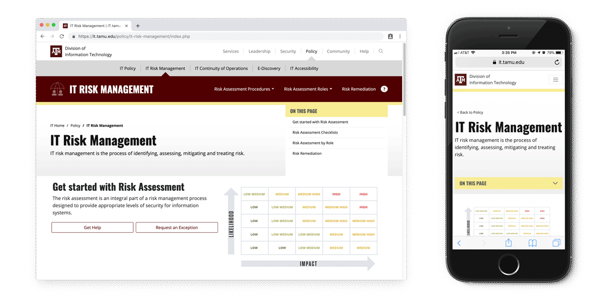
The solution we settled on was a three-tiered "navbar" that progressively reveals more options the deeper within the site you go. While this strategy does take up more real estate above the fold, it prioritizes clear way-finding within the site.
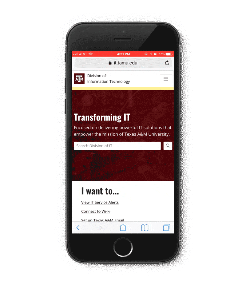
Our mobile solution provides a similarly signpost-focused experience. Mobile navigation is accessed by tapping on the hamburger menu, which reveals the site-wide search and allows you to navigate to any page in the site.
In addition, we included other ways of navigating the site:
- Prominently featured site-wide search
- Breadcrumbs on every page
- Mega-menu for available IT services
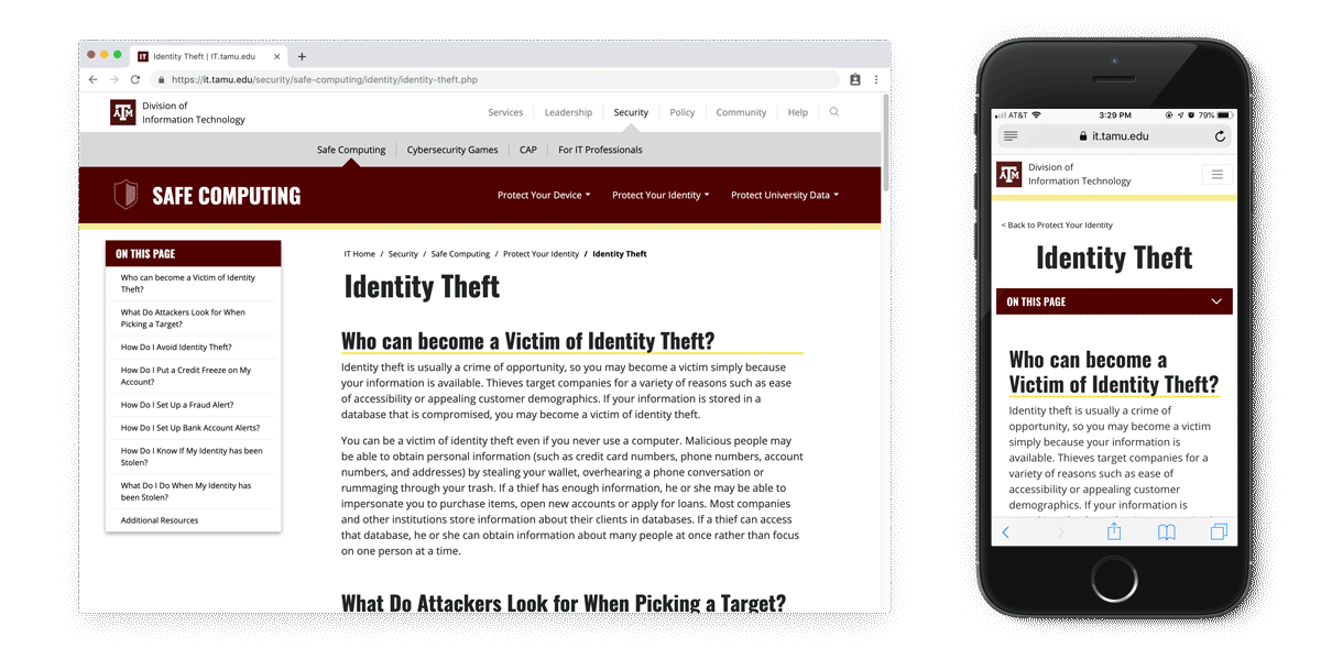
- "On This Page" navigation for pages with more than one heading
- Side-panel navigation for related content
- Buttons that link to deeper pages within a section
- Sub-footer with links to major content areas
Search
A powerful partner to our navigation strategy is prominently-featured search. A search field is available on every page of the site.

We utilized Elasticsearch technology to allow for a highly-controlled search experience. For high-priority content types, a tab is available to filter search results.
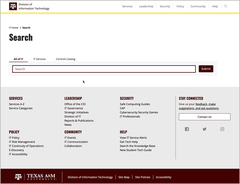
We were also able to leverage this technology to ensure that password-protected content doesn't appear in the search results.
Page-Level Templates
Each navigation level has a unique look that creates consistency throughout the site.
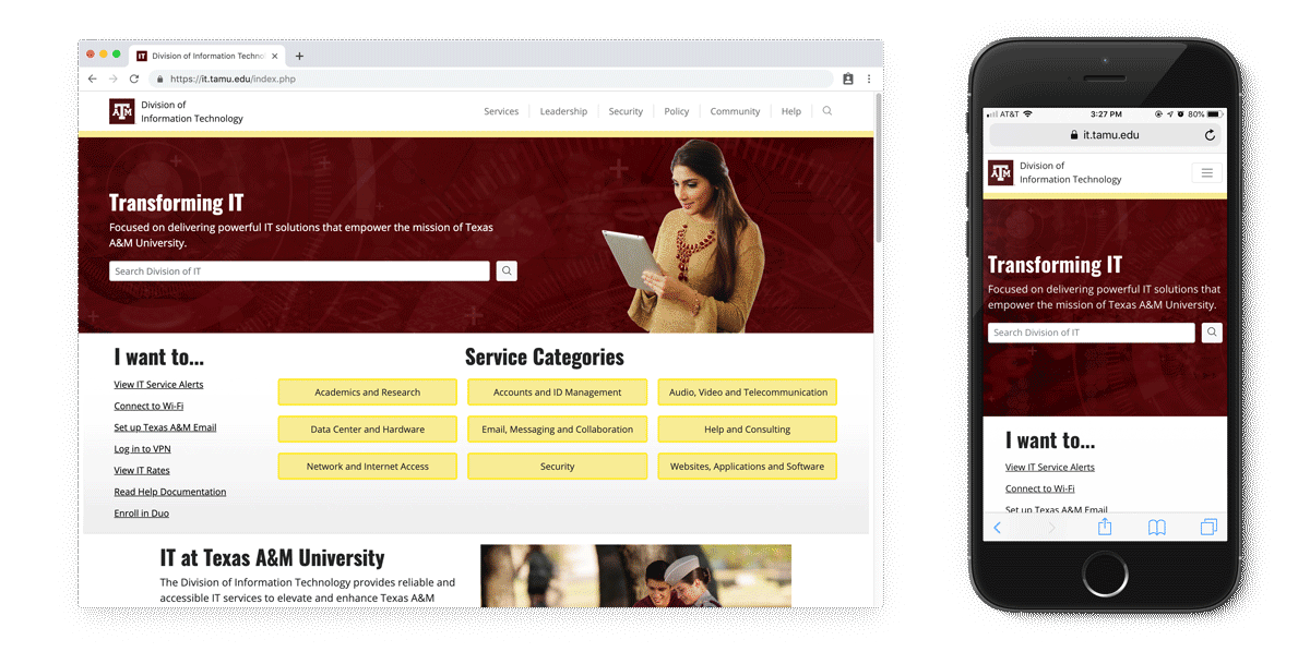
Home (Level 0)
The home page prioritizes getting visitors to the most important and popular content as quickly as possible by featuring search, "I want to" links, and buttons for our service categories.
Landing Pages (Level 1)
Top level "buckets" have a landing page that highlights important content and features within the section.
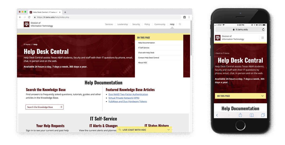
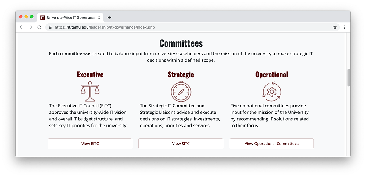
Microsite (Level 2)
With the reveal of the maroon navbar, we enter the "microsite" level. Each "microsite" has its own mini-landing page with a similar aesthetic to Level 1.
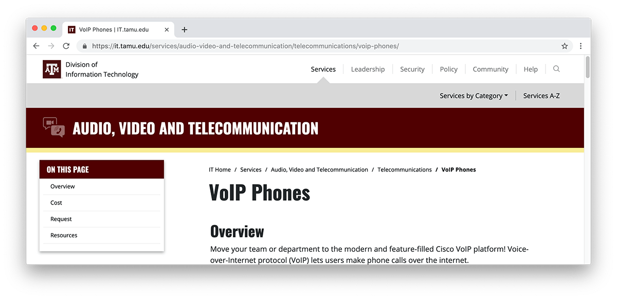
Content Pages (Level 3 and Deeper)
Content pages live within the "microsites", and utilize sticky "On This Page" and related content side-panel navigation.
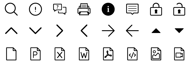
Iconography
We created a series of icons to represent each "microsite". I mentored and collaborated with a junior designer to create a set of over 140 icons for use on it.tamu.edu. They can now be found in other contexts as well, such as email newsletters, creating a shared visual library that identifies content types across our communication platforms.
UX Icons
UX icons are used to help visitors navigate the website (i.e., arrows, chevrons, and carrots), identify link types (i.e., PDFs, external, password protected), or perform an action (i.e., print, chat, search).
Content Icons
Content icons are representative of content on it.tamu.edu and are used to visualize the idea behind a "microsite" (i.e., Audio, Video and Telecommunication or IT Governance). Content icons have two versions — line and solid. The solid icons are used in the maroon navbar, and the line icons are used within content bands that link to various "microsites".
Learn more about my strategy for creating and maintaining an official icon font in my post "Designing a Custom Icon Font".
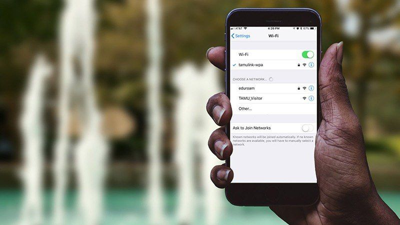
Website Images
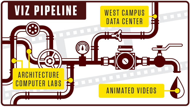
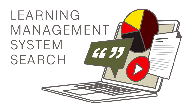
Non-content pages (levels 0-2) utilize images to add visual interest to our occasionally dry and technical content. Over the course of this project, I created and curated over 130 images for the new website, including service mockups, infographics, and more. Junior designers were tasked with creating dozens more graphics for news story cover images.


Project Team
- Hailey Yamada, Graphic Designer, Project Manager
- Chris Siems, Developer
- Dion McInnis, Developer
- Xavier Porter, Creative Director
- Allison Oslund, Content Coordinator
- Justin Everett, Content Coordinator
- Karlie Gaenzel, Jr. Content Coordinator
- Courtney Laird, Jr. Graphic Designer
- Xavier Maldonado, Jr. Graphic Designer
- Lacey Baze, Project Sponsor