Modernizing a Legacy E-Commerce Web App
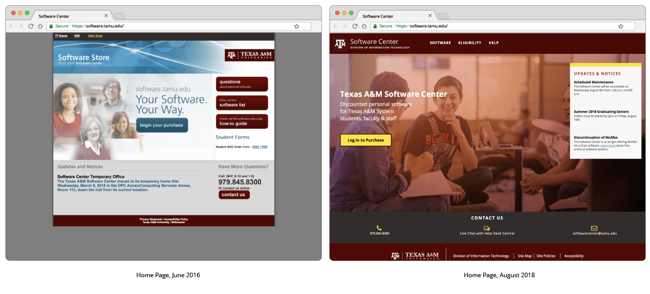
In 2016, I was tasked with updating the design of our online software store to be responsive and align with recent university brand updates. As my first complex web design project with the Division of IT, I definitely had been set up for a challenge. Over the course of this project, I would be working with a development team that was splitting time between keeping the application operational and updating the front and back-ends to match my vision.
A little bit of background
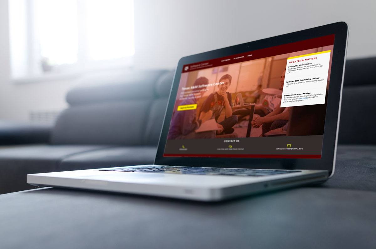
The Texas A&M Software Center, or software.tamu.edu, provides no-charge and discounted personal-use software to students, faculty and staff of the Texas A&M University System. Each of the eleven system schools can opt-in to providing a particular software to its faculty, staff or students.
The licensing logic of which software is available for a particular user is quite complicated and has evolved significantly from when the app was initially developed around 2010. The changes in business practices, licensing structure, and time pressure to keep the app up-and-running 24/7/365 had led to a back-end that was, frankly, not pretty.
The constraints on updating the back-end in order to enable features from the redesign required planning for visual and feature updates to roll out in phases, a process that is still continuing in 2019.
My Vision
Looking at the Software Store in 2016, I had two key goals:
- Make the site responsive and mobile friendly
- Make the purchasing process more intuitive
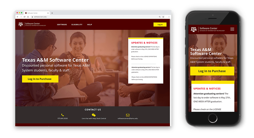
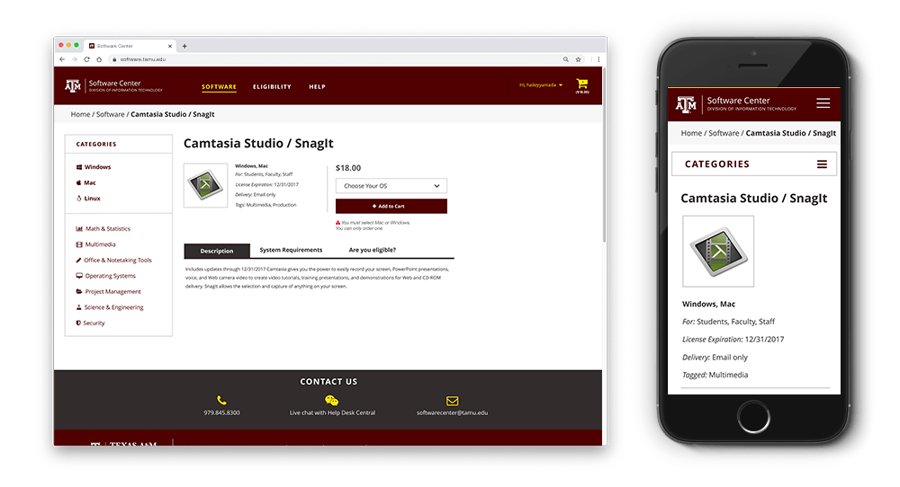
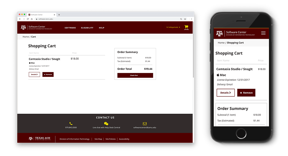
1. Make the site responsive and mobile friendly
This was our focus for Phase 1 -- front-end only, focusing on making the site responsive and adhering to the new university brand guide.
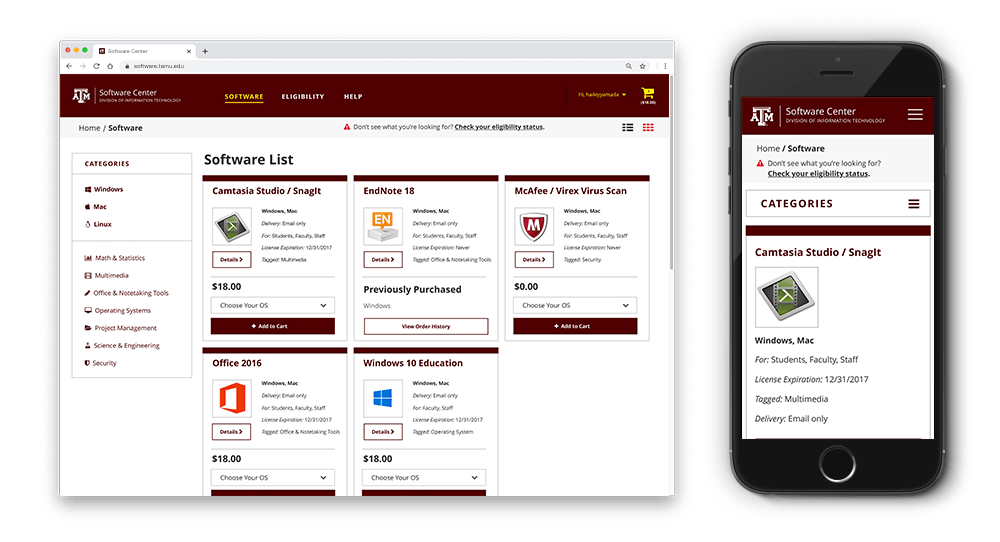
Updating the Purchasing Process
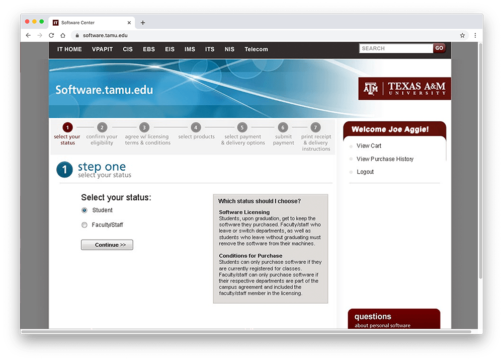
As implemented in 2015, the purchasing process for software was very confusing. The top of the screen told you you were in a 7-step process, but not all steps were required or actually visible for the shopper, making for a very confusing process.
To make the check-out process more intuitive, I designed a simplified three-step solution.
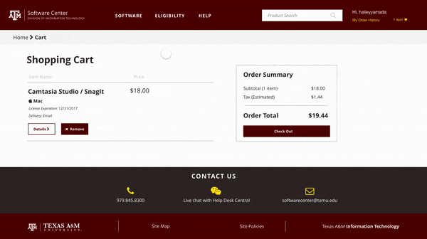
While not able to completely change the check-out experience to match my design, we were able to address some of the harshest problems from our starting place.