Designing a Custom Icon Font
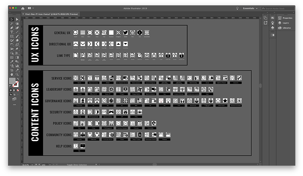
As part of the One IT project, I mentored and collaborated with a junior designer to create a set of over 140 icons for use on it.tamu.edu. These icons create a shared visual library that identifies content types across our communication platforms.
Icon Categories
UX Icons
UX icons are used to help visitors navigate the website (i.e., arrows, chevrons, and carrots), identify link types (i.e., PDFs, external, password protected), or perform an action (i.e., print, chat, search).
Content Icons
Content icons are representative of content on it.tamu.edu and are used to visualize the idea behind a section of content (i.e., Audio, Video and Telecommunication or IT Governance). Content icons have two versions — line (ln) and solid (sd).
Design File Setup
The One IT icons were created using Adobe Illustrator. My junior designer completed the process work in a living document. She first would find inspiration for each icon, then we would discuss which examples would work the best in the overall set. Then she would work on creating them and I would critique until they were at a place I was happy with.
Final approved icons were then added to the Final Illustrator file, where they were arranged by type (both Content vs UX and sub categories for each). This allowed for a visual way to find things. Each vector had its appearance expanded (outline stroke), was centered to its artboard, and its layer locked.
Each artboard is named according to the One IT icons naming convention and arranged alphabetically. Naming the artboards saves time on export and makes it easier to find them in this large document.
Naming Conventions
UX icons are named by common convention. The names of the Content icons match the folder on it.tamu.edu that the icon represents. On the website, the class for the icon in the maroon navigation bar is determined by looking at the folder name and adding "icon-" to the front of the file name and "-sd" to the end of it.
Example: class="icon-{{folder-name}}-sd"
- All lowercase
- No spaces, words separated by hyphens (-)
- Line icons end in the suffix "-ln"
- Solid icons end in the suffix "-sd"
- UX icons do not have a suffix
Even with this naming convention informed by the website directories, sometimes the icons required more than one class name. For these cases, we added "patch" class names to the CSS and SCSS files from IcoMoon.
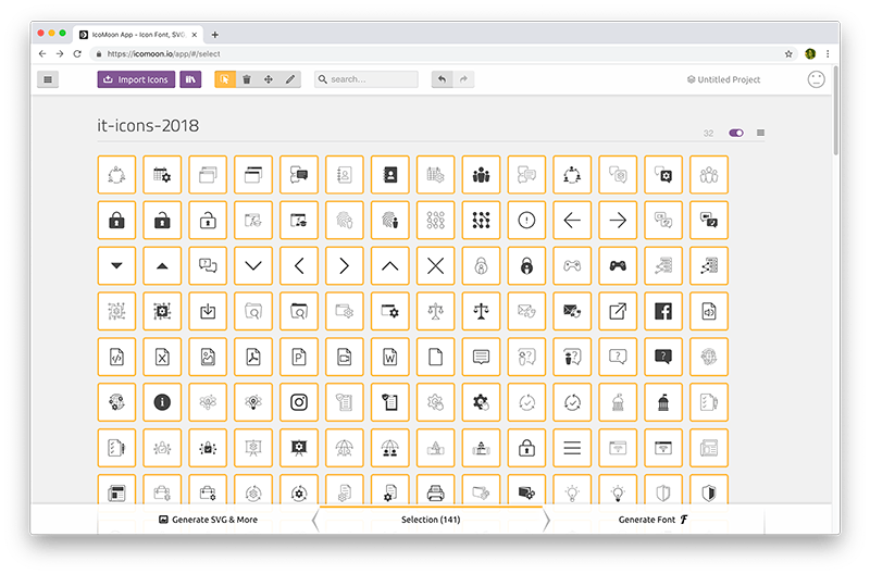
Adding Official Icons to Icon Font
We used IcoMoon App to turn the vector files into an icon font. Because we had iterative releases of content in the One IT project, we were regularly adding new icons to the font. Luckily, IcoMoon allows you to upload a JSON file from a previous selection and make adjustments to it.
I created a GitHub project to make sharing the icons with our developers easier. In the GitHub project, I included a README file that detailed the steps for adding icons to the font to make the process repeatable for other designers on our team. This included instructions for recording "patch" names in the CSS and SCSS files.