Better Together Annual Report
In 2019, the Texas A&M Division of IT decided to shift from print to a purely online annual report. The report capitalized on using techniques that were uniquely available to digital delivery.
This report was awarded "Best of Category" for computing newsletters in the 2021 AMC SIGUCCS Communication Awards.
View the whole report at it.tamu.edu/annualreport.
Color
I created a color palette that was bright and eye-catching that when layered on top of each other blended into the Texas A&M brand colors.
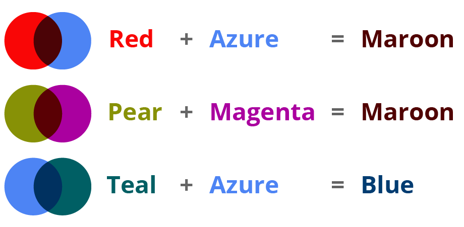
Using this technique, we were able to visually demonstrate how colors were "better" when they came together – for example, the red and azure colors were attractive on their own, but were even better when they came together to make Aggie Maroon.
Typography
We used an animated typeface for main page headings that revealed our "better together" color palette using movement. We modified Gilbert animated typeface using our project's colors to create a unique experience we could only have on the web.

Animations
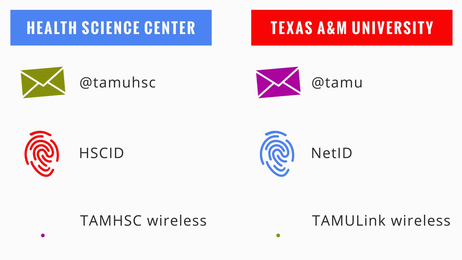
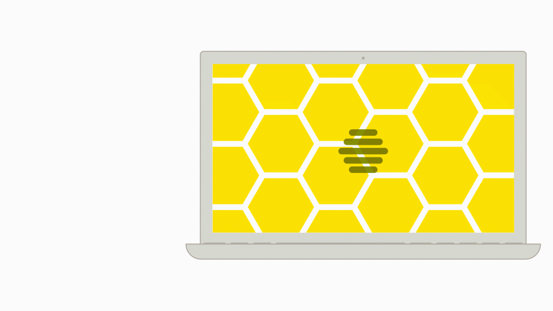
IT stories can be very technical and hard for non-technical audiences to understand or be interested in. In this report, I created several short animations to illustrate technical concepts to accompany stories. Each animation builds on the ideas of using movement and color to visually demonstrate the concept of "better together" while explaining a key idea.

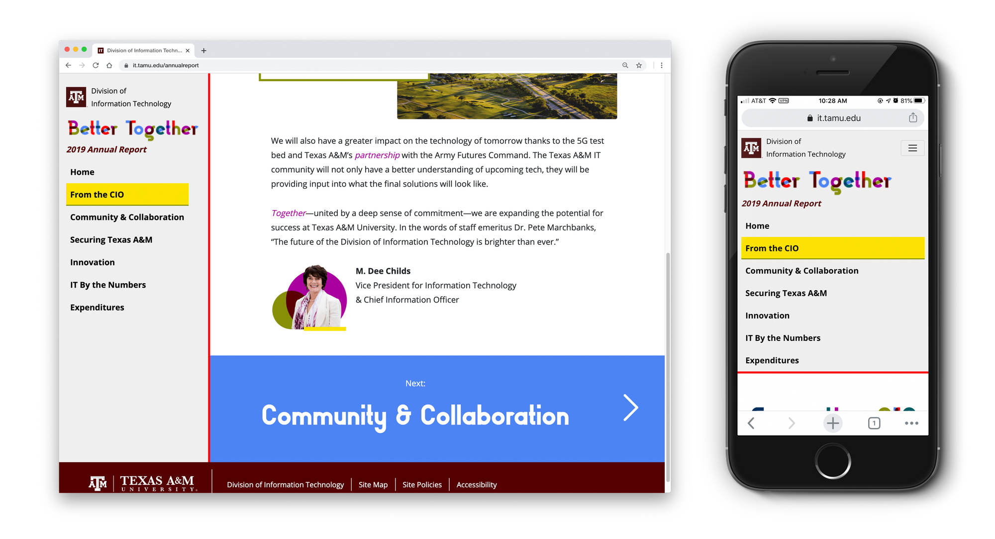
Website
We wanted to allow for a linear reading experience similar to a printed report, but empower readers to easily jump to whatever section they were the most interested in.
To do this, we created a navigation structure similar to our past printed reports, where content was divided into sections. Each section is a page filled with stories, and the last item on the page is a big button that takes you to the next section.
For a nonlinear reading experience, we constructed a navigation menu that doubles as a table of contents.
Project Team
- Hailey Yamada, Graphic Designer
- Chris Siems, Developer
- Paige Rod, Project Manager
- Xavier Porter, Creative Director
- Bobby Bernshausen, Content Coordinator
- Lacey Baze, Project Sponsor